I am very happy with the video as I think it is suitably entertaining and interesting. I do wish we could have remained with the scenes of the policeman and dancing that got deleted as it was a friendly way of ending the video and conveyed the characters' new attitudes. I have enjoyed this project, though it was harder than last year's coursework as there was more editing and research involved. I am pleased with my group's efforts; Aiden kept his cool throughout and Ali was extremely useful in his knowledge of design technology. I go now.
Adios mi gente!!

6th form A2 media coursework
Wednesday, 8 December 2010
Monday, 6 December 2010

Saturday, 4 December 2010
EVALUATION QUESTION 4: HOW DID WE USE MEDIA TECHNOLOGIES IN THE CONSTRUCTION AND RESEARCH, PLANNING AND EVALUATION STAGES?
Here I will describe exactly what media technologies we used during the three stages of our project.
RESEARCH/PLANNING
Believe it or not, the internet was what we used for our research. Once Aiden told us that his uncle was Roni Size and how we would most likely be able to use a song of his, we each looked through his songs on YouTube and on his Myspace.


Sure enough, Aiden used his mobile phone to make a call to his uncle who said there was no problem using a song of his. If he had, for some reason, not allowed us, we would have obviously searched for unsigned artists/groups through internet and word of mouth. Thankfully, we never had to deal with spending time finding someone as we already did straight away.
Roni Size's myspace page had only a few songs, and it was on there that we first heard the song 'No More' which we found appealing because of its slower tempo, melody, and lyrics. We also used google to search the lyrics so we could print them out for studying them when it came to coming up with ideas for the video, and so we could give them to any actors we may need to learn lines. We also used Youtube to watch some Roni Size music videos to see if there was any influence we could gain from them. We also looked through his website and his page on wikipedia for research on the artist.

Obviously, we used this website Blogger to write up our process, as well as to follow each other's separate research and analyses. Once we had drawn our storyboards and written our shooting schedules, we used a scanner (as seen below) to scan them onto the computer so we could insert them onto our blogs.

Finally, we used the online delivery website Amazon to order the four masks for the actors to wear.
CONSTRUCTION
We used digital camcorders (mostly my own, but we used one of the school's alongside mine during the filming of Julia) so that we could actually film anything. The only problems we had with the digital camera was that the battery ran out during the start of our filming of the cigarrete-jabbing scene, but this was quickly resolved by exchanging our battery with a fully charged one from the media department. Having had plenty of previous experience, we were at complete ease with filming hand-held. The only time we used a tripod was during filming Julia, when we had one camera placed on a tripod directly in front of her for a completely steady mid-shot; we ended up only inserting about five seconds of this shot into our music video. The rest was hand-held because not only was it easier to film some sequences this way, but also because any unsteady shakes we had went well with the song's tempo. The LCD screen is also very useful as we can see what we are filming without having to put our eyes right up into the lenses (as one would whilst using older cameras) which could affect our camera movement.

This is exactly how our cameras
looked except that the colour was a
lot darker and we didn't have this kid
on our LCD screen.
Of course we needed some tapes so that we could record anything, of which we used two.

To take pictures of our filming, filming locations, and any images we needed for our cd inserts, I used the camera on my mobile phone which was good enough quality. When it came to editing, we used the programme iMovie, on which we cut clips and put footage in order, as well as choosing transition and lighting effects. The most common feature we used was they key 'Apple + T' to cut footage. This programme was on the iMacs.

For the creation of our CD sleeves and advert, we used Adobe Photoshop to create the right visuals. Firstly, we created a new project and then unlocked the image. Once our images were on the programme, we changed the colour to black-and-white and used the 'Dark Strokes' effect for the inserts of the two masked characters. We then placed the slogan in red lettering. For the other two inserts, we made sure they were both in black-and-white and used the same red lettering for slogans and fictional credits. The album cover was done by fading in an image of the mask over a picture of a landscape, also having the colour in black-and-white. We used the red lettering for the titles, track list, and brief info. For the magazine advert, we used the exact same image of our insert with one of the masked character and zoomed it in so that he is in much more close-up. Then we just wrote all the texts again in red lettering and in different fonts. I have always found the programme quite confusing and though I could use the tools, I still had to remind myself exactly where was what and which tools had what effect. My post about the work we did that day explains better.

For the editing that we used to add effects unavailable on iMovie, we used a few programmes. Photoshop and AferEffects enabled CGI effects to be added - this was needed for the blood and for making the cigarette look alight, as well as for creating the more cinematic-style colour in our video which was made through trying out different colours and contrasts.

The programme AfterEffects was also crucial so Ali could overlay Julia onto the narrative scenes, and to write a formula which enabled the visuals to zoom in and out and shake around thus matching our audio.

A video converter programme was used to change the file's format on AfterEffects so that it could be uploaded back onto the iMacs as they had different outputs. Also, so that we could transfer the files we used usb memory sticks. We also used this memory stick to transfer the actual song so that we could import it onto iMovie.
Facebook and MSN were used for each group member to contact each other regarding filming days and editing processes. Oh and of course, we used this website Blogger to write up our process!
EVALUATION
We did not use many media technologies for this stage in comparison to the other two. Obviously we continued to use Blogger to write our evaluations..for our audience feedback, we decided we would just use the video cameras on our phones rather than to prepare the camera and find a firewire to upload them and all that business; instead we quickly used USB cables to upload them onto our computers. I also used my phone to take a picture of the sample questionnaire as scanners were unavailable. This method was much more simple. We used Quicktime Player as we had to convert our original music video into this format so that we could upload it onto Facebook and onto a DVD for burning, as were unable to do so straight from the iMovie programme.

Speaking of which, we used a DVD for burning our music video onto it so that it can be sent off. We briefly used the internet to reinforce our previous research on drum and bass' conventions, but that is all.
Thursday, 2 December 2010
EVALUATION 3: WHAT HAVE WE LEARNED FROM AUDIENCE FEEDBACK?
Audience feedback is really important to all media industries; in this case, the music industry. The public's opinion is a detailed method for artists and producers to reflect on their work, as they may become aware of certain flaws they had not realized otherwise; it can also influence them on how to improve certain aspects of their work and it is also encouraging when they are given support. When the feedback is positive, it is beneficial for the artist's confidence as they can acknowledge their success and happily further establish themselves in their area of expertise.

The industry is keen to please their target audience as they are rewarded with money. That is why audience feedback is so important - listening to the public and pleasing them means more sales of the artist's work, more interest and reports by the media, more concerts; it is all round beneficial for the artist/s and all those involved. Ignoring audience feedback is a major fault it can lead to a huge failure - if the feedback is bad and nothing is done about it, the artist and companies risk losing fans, money, endorsements, and any interest whatsoever.
Our target audience was from ages 16-25 but we tried to widen the appeal to older members as well because we believe the message it sends can be appreciated by all ages. We have received a lot of feedback as we had five questionnaires filled out and uploaded the video onto Facebook where people commented on it. We also had people just randomly watching it in the editing room. The comments on Facebook were all short and positive comments including "this is impressive" and "loving the work!". I showed the video to a fifty year-old woman who claimed that she enjoyed it, that the video was interesting entertaining and that the message of anti-violence was clear to her. Many praised the effects we used and the shaky movements we added during editing. They also told us they understood the video's meaning/message. We also had positive feedback on our album cover and advert. We were told the front and back covers looked somewhat menacing which is what we wanted, and that the slogans and insert images were effective and a good idea, although some said the image of the policeman was less effective than the others. Nothing bad was said about the magazine advert, everyone claimed it was eye-catching which pleased us a great deal.
Here is an extremely positive questionnaire feedback from an 18 year old girl. The quality of the picture is awful so I have written it underneath.

1. Did you enjoy the video? Answer honestly.
Honestly loved it, wouldn't mind watching it again
2. Did you feel there was a message being conveyed, if so what?
Street crime being stopped
3. How did you feel about the violence displayed on the music video?
They presented it in a really good way
4. Did you understand what the mirror scene was referring to; if so what is the correlation?
It was from the film taxi driver I think
5. Which of the three scenarios do you find the most effective?
I really liked when the policeman came rapping
6. Which part of the video did you enjoy the most?
The end part and the start
7. How clear was the meaning of their taking off the masks?
Really clear it showed they ended all the violence
8. How well do you reckon the visuals matched with the audio?
She left this answer blank so I presume she did not understand
9. What is our opinion on the shaking/distorted effect used throughout the video?
Really liked it added a special effect to it
10. How conventional is the video for its genre of drum and bass?
Very
11. Would this video encourage you to buy the album (which would be filled with similar songs and lyrical content)?
Yeah to be honest
12. How effective and cohesive are the album cover and advert?
There is a strong cohesion with the masks and they are effective and interesting
12. What would you have changed?
Umm... nothing really I can't think of anything
13. What would you have added?
I don't know
I don't know
14. Please rate out of 10. Do it!
1 - 2 - 3 - 4 - 5 - 6 - 7 - 8 - 9 - 10
She rated a nine. Wow!
She rated a nine. Wow!
No one told us that they did not like the video, but there were indeed forms of negative feedback. For example, one girl told us she enjoyed the video but "not so much the violent parts". She said the violence was uncomfortable to watch and that if she had changed anything she would have had "less violence". This is a fair enough opinion, but I think it would have been harder to prove our point if we did not display the violent moments. Interestingly, she said she found the phone-mugging scenario, which was the shortest, the most effective because it related to social class. I am glad she noticed that as it was an aspect we were keen to show but that was not emphasised much.
Surprisingly to me, a couple of people said they did not understand what was going on from the rap scene onwards (not understanding who the rapping guy was, why they threw off the masks) which means that they did not grasp the meaning of the ending. I found this disappointing as I reckon it was quite obvious he was a policeman as he shows his badge, and them taking off the masks after he has a word should make it fairly easy to put two and two together as to what is going on.
Here is an interview with a female of 17. We were pleasantly surprised to find that she is a fan of Roni Size, telling us her brother got her into his music.
Unfortunately the file on the phone did not work during the uploading. Very disappointing.
Unfortunately the file on the phone did not work during the uploading. Very disappointing.
During the video, she says she enjoyed it, and gave interesting criticism on the visuals claiming they were too shaky. She also criticised the use of a white person for the rapping scene as the vocals sounded like they were obviously coming from a black man. This is something we were always aware of and had indeed been looking for a black male to do the part but none seemed keen to do it and we were running out of time. We just hoped it would not be too noticeable but sometimes it is just inevitable.
We were very interested to see what the artist himself Roni Size would make of our video, so Aiden passed by his studio one evening and used his phone to record some quick feedback by his uncle.
We are glad that he liked the video, it would have been very disappointing if he kicked at the screen screaming how horrible it was. He comments on how there could have been more energy and sharper edits; I reckon he was underwhelmed at the pace of the visuals because of how used he is to seeing professionally speeded visuals in so many of his own music videos and others of the genre. While it is a bit disappointing he did not grasp the full meaning of the masks, he did understand the message and we are grateful that he told us we made a good job.
Wednesday, 1 December 2010
EVALUATION 2: HOW EFFECTIVE IS THE COMBINATION OF YOUR PRODUCT AND ANCILLARY TEXTS
The main motif that links our music video, album covers, and advert together is the use of the masks. The masks are an integral part to the campaign as they symbolise the violence and crime that we want to get rid of; it is when the characters wear these masks and 'hide from society' that they indulge in these acts of violence against it. All three products are cohesive by including this representation, which is seen constantly throughout the video, is faded onto the covers (and seen in the inserts), and is the main interest of the advert as the image would not be as effective without it. Because the masks are simple yet intimidating and thus memorable, purchasers will recognise what campaign each product is part of after they've seen one because they would remember the mask's image.


There is another strong cohesion between the CD sleeve and advert but not so much the music video - this is the colour. The covers, inserts, and adverts have the same harrowing colour effect of black-and-white with some red boldness, but this is not the case with the video. Had we known right from the start that is how our other products would turn out, we may have considered doing the same for the colour of our music video and shoot it in a way that we could incorporate lots of red colour for a variety of things onscreen. But having said that, if we had the exact same visuals in all three products, then sure enough there would be a strong link but it would then give an appearance of lack of imagination if they are all given the same treatment. Besides, the music video is a full representative of one song out of eleven on the album. We did give the video a grainy look, so it's not exactly bright-coloured. There is a synergy between the CD inserts and the music video as the inserts are full of images to do with the video, either being screenshots or stills we took on location.

The image on our magazine advert is taken
straight from the video
An already existing cohesion of the artist which we have followed is the placing of Roni Size's logo on our album cover, as he has the logo on his album covers; so our combination is effective enough.

Cohesion is important so that the product is recognisable and reaches its target audience's attention; this way the artist's sales and interest are continued as their fans stay loyal and remain interested in the marketing surrounding the artist - if an artist changes its established image, fans can feel disappointed and betrayed and lose interest. However, some artists do take the risk to alter the cohesion they have been following. A prime example is pop star Madonna, who evolved continously through changing her image every two years or so - new looks, new music styles, new ways of presenting herself, new attitudes, new acts, new designs etc. She proved a change of image does not lose all an artist's fans, indeed it can gain even more.
Our campaign gives a rather gritty and deep image which is unusual for Roni Size as he has already established himself. Obviously, were this for real, it could be an example of the artist moving into a new direction which could be succesful or not; given the subject matter I think it could gather plenty of interest.
In conclusion, I do indeed find the combination effective because all three products are cohesive and stand out due to the strength and meaning of its theme.
Monday, 29 November 2010
EVALUATION QUESTION 1: IN WHAT WAYS DOES OUR MEDIA PRODUCT USE, DEVELOP OR CHALLENGE FORMS AND CONVENTIONS OF REAL MEDIA PRODUCTS?
It is not simple to fully decide on how conventional our music video is in relation to the genre of drum and bass as the song 'No More' is a somewhat unusual drum and bass song. Someone could even mistake it for a song of the R&B genre. This is because the song's amount of differing lyrics and slower tempo allow more of a melody and less of that 'boom boom shake the room' which drum and bass is mainly associated with. However, the beat is still fast enough to be classified under the genre and there are many cases of even slower drum and bass songs, many of which fall under the intelligent/atmospheric drum and bass sub-genre which I mentioned on my drum and bass research towards the start of the blog.
The conventional aspects of drum and bass music videos are showing a performance (sometimes live) by the artist/s, or containing a narrative concept most likely filled with abstract images, or quite commonly a blending of the two. An example of this is the video to 'Propane Nightmares' by Pendulum; the narrative section shows the group as part of a religious cult trekking through a creepy forest into a desolate house where the cult proceeds to each commit suicide; these somewhat disturbing scenes are intercut between the band performing onstage in the house during the carnage, before attempting to escape.
This mixture of performance and narrative is roughly what we have done, though with more emphasis on the narrative. Obviously the singer and rapper we have are not the real ones but our point comes across. Our video does not contain any abstract visuals, although we have a couple of symbolic images but no abstract ones. So whilst we do follow the conventional style of a drum and bass music video, the fact that it carries a social message makes our video a little different for its genre. This is because although many music videos do carry social themes, such as the video to 'Where is the Love?' by The Black Eyed Peas, the genre of drum and bass does not seem to go down that way.

One of the symbolic images is of a church
at the start of the video before the characters
are even introduced; its image represents
the peace and unity both which is part of
the anti-crime/violence message of our
video and which the delinquents eventually
come to find at the end of the video.

The next symbolic image is the final shot of
the video, which shows the three masks thrown
on the floor. This image symbolises the characters'
sins thrown away and forgotten, and is very
important as this action of 'taking off' violent
and anti-social ways is what the video encourages
those real-life versions of our characters to do.
The lyrics and mood of the song contrast heavily as the lyrics are distressing and desperately wishful, but the melody and musical arrangement of the song are upbeat and fun. This contrast is similar in our video. The content is depressing, but we have presented the visuals an entertaining way through the shakes and zooms as well as the near-parodic scene of the policeman rapping.

The use of distressing lyrics being sung in an
upbeat way is shown well by Julia as she is seen
smiling and has a positive presence. It is as if her
presence in the video, fading in and out of the
violence, is like a ray of light which eventually
guides the characters to the right path.
Although we only have two brief brutal-ish moments (the blood splashing out and the cigarette jabbing), one may think that such violence is inappropriate for music videos. Well there are many music videos which contain very grim content and (mostly in heavy metal music videos) a fair amount of gore. A good example of a grim content in a music video of the drum and bass genre is the video to 'Smack My Bitch Up' by The Prodigy; this video depicts a night out filmed from a first-person perspective and shows scenes of drinking and driving (including a hit and run incident), drug use, vandalism, violence, and sex. So our video is actually quite pleasant! If this was a real video, it is quite likely they would have an 'edited' version which would cut the shot of the victim being kicked in the head, and of the cigarette in the eye.
The editing to most drum and bass music videos consist of really fast and flashy shots and shaky camera movements, which rapidly zoom in and out and spin around distorting the visuals. A good example of this is the music video to Reprazent's song 'Who Told Ya', in which VIDOEOFO. We have followed this tradition by giving the video the same style of shaky movements and rapid zooms which we achieved through editing. Had our video been done professionally, there would have also been a vast array of rapid shot cuts but that was too complicated for us.

Here is an example of the zoom and visual
distortion.

Another aspect to making our video look
realistic was contrasting the colour and adding
lenses flare so that it resembles real music videos.
As I mentioned in an earlier post, the most common drum and bass album covers consist of an abstract/unusual image, or of a more straight-up image displaying a set of speakers/ravers/rave paint/music notes. I reckon that our album cover is cohesive with the abstract style drum and bass album covers, not at all with the straight-up style. While not totally abstract, I think that our cover is suitably strange enough as the black-and-white image of the wide isolated landscape with the faded mask raises questions as to what it means.

I find this cover a bit similar to ours as
the image is also shows a long shot of
an empty landscape.

There is no specific tradition for a magazine advert advertising a drum and bass album as they are inspired by the album covers/styles themselves, so the adverts will also be done in one of the two styles I mentioned. Ours is cohesive with our use of the mask on the cover, first insert, and music video as it shows one of the masked characters walking. This is not abstract as it is quite simple but we feel it is an effective image.

Friday, 26 November 2010
FEEDBACK QUESTIONNAIRE
Now that we have finished the video, we will hand out five questionnaires for feedback to people of our target audience (16-25 years old, enjoy drum and bass).
Here is what the questionnaire consists of:
1. Did you enjoy the video? Answer honestly.
2. Did you feel there was a message being conveyed, if so what?
3. How did you feel about the violence displayed on the music video?
4. Did you understand what the mirror scene was referring to; if so what is the correlation?
5. Which of the three scenarios do you find the most effective?
6. Which part of the video did you enjoy the most?
7. How clear was the meaning of their taking off the masks?
8. How well do you reckon the visuals matched with the audio?
9. What is our opinion on the shaking/distorted effect used throughout the video?
10. How conventional is the video for its genre of drum and bass?
11. Would this video encourage you to buy the album (which would be filled with similar songs and lyrical content)?
12. How effective and cohesive are the album cover and poster?
12. What would you have changed?
13. What would you have added?
14. Please rate out of 10. Do it!
1 - 2 - 3 - 4 - 5 - 6 - 7 - 8 - 9 - 10
Tuesday, 23 November 2010
ADIOS TO EDITING!
We have finished whey!
We realised that we had forgotten to add the Taxi Driver reference scene. Oh dear! Anyway we added those remaining clips in, but as a result the rap scene became out of time as the policeman starts rapping a while after Dynamite MC's vocals begin. We speeded the scene up apart from the gun miming but we still had more we needed to cut. As overlaying of Julia in our cigarette-jabbing scene is of the long-shot we had of her, we realised we could cut that scene as you cannot see her mouth moving; so even though her mouth is moving out of time, it is not noticeable at all. We cut the beginning of the scene so that it starts with a quick shot of the kid playing football, and cut some of my walking. The timing is now all matched.
Crucially to the drum and bass visual convention, we added in shakes and zooms through writing a formula so that our visuals match the tempo a bit more. After adding the song's title and artist at the begining, we finished. Whey! We are happy with our final result. Next step is to get audience feedback and work on our evaluation.
Saturday, 20 November 2010
JULIA STEPS ABOARD
Hola mi gente!!
So Ali already took the two files home to overlay Julia onto the narrative. We are happy with the result and are grateful for his work. However, he did it before we could edit the scenarios and so they remain too long. We cannot edit them as planned because as we now have Julia fading into the scenes singing, anything we cut out will mess up the visuals as she will be seen moving her mouth out of time to the vocals. We do not think that the edit error of the first character's head emerging through the corner twice can be noticed much as Julia is added into that shot and distracts the viewer from noticing.
We reckon that Julia is shown to a good extent, as her presence is not overstayed and does not lose its novelty. Actually, she only appears until halfway through the cigarette scene, then she disappears. So we will definitely add a shot of her into our gap later on. The way her happy face fades in and out of the violence works as a nice contrast in the visuals.

Friday, 19 November 2010
OUR TRIP TO CLC - ALBUM COVER, CD INSERTS, AND POSTER FINISHED
On tuesday we all travelled to the City Learning Centre at the Orchard School to create our fictional album cover, any cd inserts we want for what would be the leaflet inside, and a fictional magazine advert promoting the album.
Upon our arrival, the whole group was given a tutorial on how to use the programme Photoshop through using a picture of a Geisha-like woman who seemed to be modelling. The woman in charge there was very helpful as she guided us through tools and devices we used to edit the picture through removing parts, replacing them, adding effects and styles, all to the point that by the end it was completely different but remaining with the same face. Certain tools we used included the magic wand, which completely cut away parts of the image we did not want, and we learned some shortcut keys including the apple button +D to deselect things and apple and +Z to undo.

The CLC
But now it was time to get cracking on with the main task.
CD INSERTS
The images on the four inserts were a mixture of photos taken while filming and stills of the video, so we first had to find them on our e-mail attachments and add them onto the Photoshop programme.
The images were two separate ones of two of the criminals, one of the bike-mugged character lying on a pool of blood, and one of the policeman showing his badge. We chose these images because of both their cohesiveness with the video and their strength in effectiveness: two images of the criminals relates to the overall campaign and gives an alarming look to the cd inserts thus gathering interest, the image of the mugged victim lying in a pool of blood is harrowing and reflects the slogans we placed around the inserts, and the image of the policeman showing the badge is like a conclusion the first three images as if to say there is now some control.
Here are the images as they were when downloading them off our attachments:


The image of Ali on the ground is silghtly different to the footage in the video as there is a larger amount of blood (this being his position before attempting to get up), but this way it is more alarming and even makes it look like he is dead which goes better with the slogans we placed. This image was already different as it is in black-and-white apart from the blood which is bright red and stands out. We had decided we would use this after some inspiration from the visuals in the film 'Sin City', in which the colour is majorly black-and-white whilst some crucial colours (mostly of the blood in that film) are kept.

Here is an example of how the colour
red contrasts with the black-and-white
visuals of the film Sin City
Bearing in mind that the inserts were to be cohesive, we decided that each insert would be in the same style of black-and-white with a red colour. So after changing the colour to black-and-white, we stylized the images of the two criminals with the use of the 'Dark Strokes' effect (one of the visual effects available on the programme) which gave them a slight blurry effect and also contrasted the images, resulting in a somewhat rougher look which was altogether effective for the grittiness of the theme and the intimidation of these characters.

We added two slogans on each insert which conveyed the continuous message of anti-crime: the slogans read 'Face the world', 'Walk to the light', 'Unmask and be free', and 'The reward for good is life'. We used the red font for writing these so that we had the use of red. We also put Roni Size's logo at the top of the first insert, which we grabbed from the internet. For some reason, all the pictures of our inserts, cover and poster are coming up small so just click on them to view them better.

Inserts 1 and 2
So the next two inserts were the images of the victim bleeding on the ground and of the policeman. Once they were both in black-and-white, we played around with using the 'Dark Strokes' effect and some others but found that they didn't work with the image of the victim as each effect ended up blurring or somehow fading the blood which then did not look effective enough as we needed it to brightly stand out. So we left the image without any effects and added another slogan, this one saying 'No more crime on the streets - pain violence abuse'.

For the insert featuring the policeman, we stretched the picture out a bit to make him look bigger so that he looks a bit more authoritarian. We then added a few fictional credits for credibility. We know that Roni Size is fully in charge of his music - so the credit of producing, mixing, and arranging goes to him. We made up some fictional names for the rest, and gave ourselves a little wink by putting our names for the 'with thanks to' credits. Taking notice of how this section of album leaflets mostly say in small writing the country that the product was made in, the album's label, year of making and the artist's website, we put those details as well.

Inserts 3 and 4
ALBUM FRONT AND BACK COVER
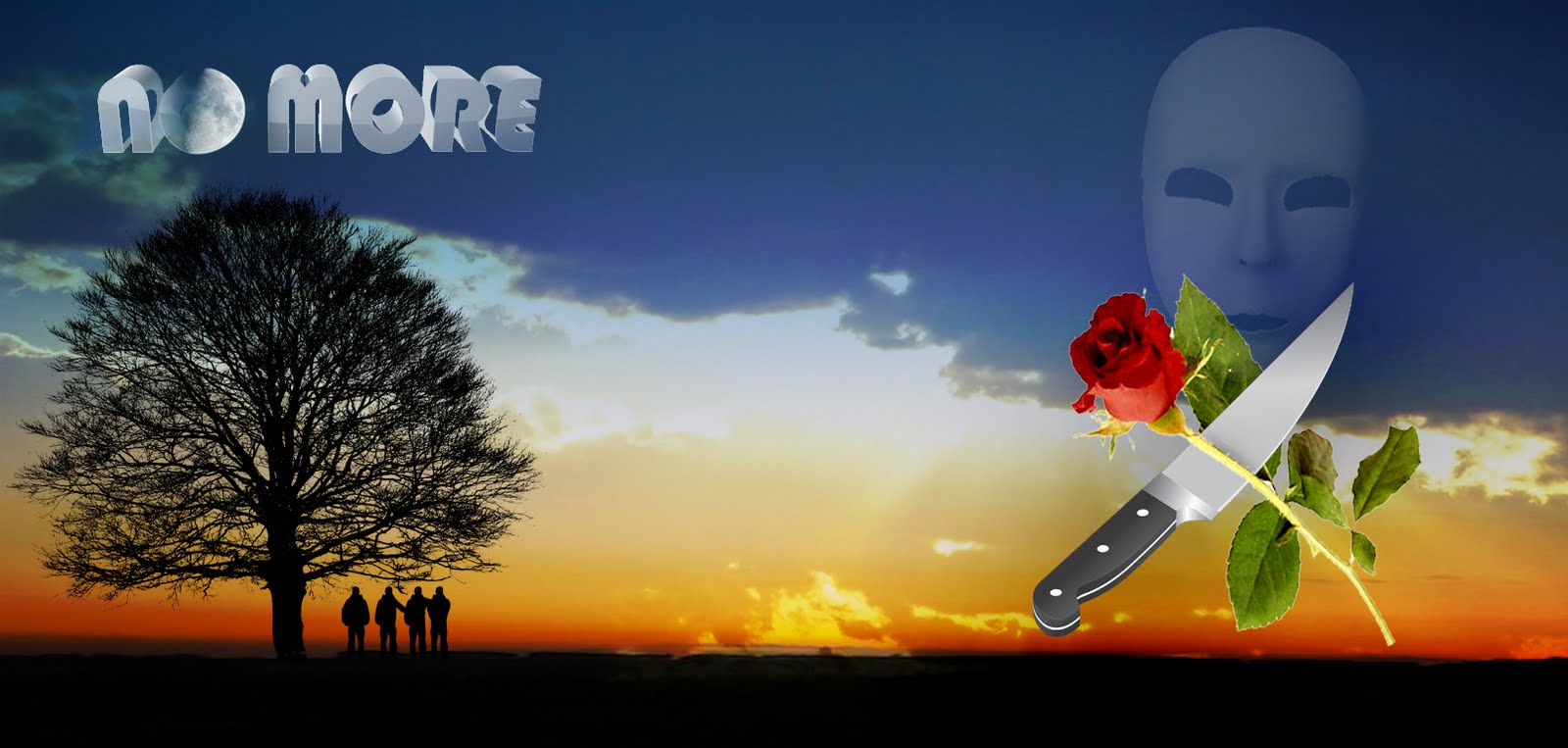
For the album's back and front cover, our final design differed a fair bit from our rough draft idea from a while ago. The original plan was to show a group of figures stood upon a hill in a paradise-like desolate location, with the image of the mask faded in the background to represent the threat they want no more of and an image of a knife and flower/s wrapped together symbolising violence against peace.
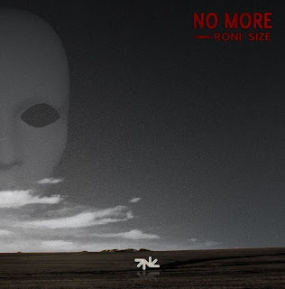
However, as we had to keep the cover cohesive with the inserts, it was clear this was also be in black-and-white with red. So the image was turned to black-and-white, and we used the red font for the all the lettering; this consisted of the album's title, artist, track list (the one we wrote a while ago), and brief info (record label/year/website). However, everything else apart from the landscape and mask were removed because they did not fit well with the new visuals. We again inserted Roni Size's logo, placing it on the front cover. We have achieved the look of desolation and emptiness, and of threat in the form of the mask, which is seen overlooking the landscape as if the violence and fear that comes with it goes everywhere.

A rough draft of the original idea

Our album cover
MAGAZINE ADVERT/POSTER
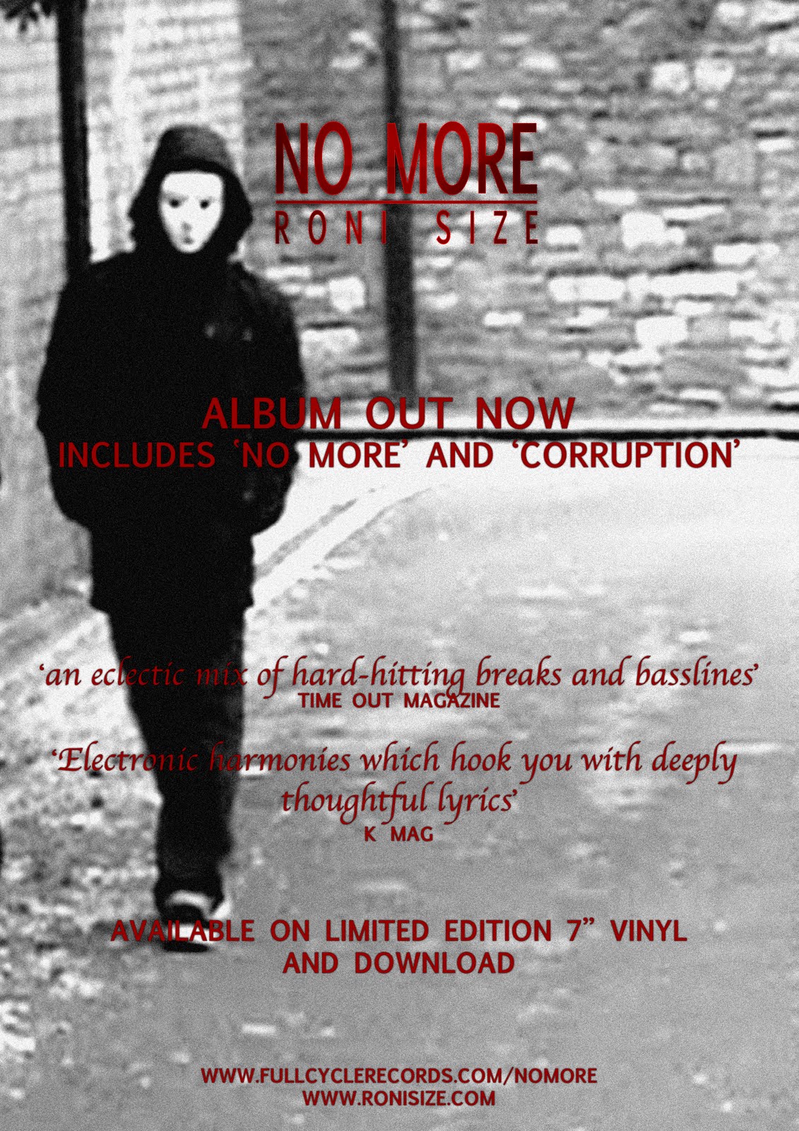
The image placed on magazine adverts of albums are usually extremely similar to the actual front cover: they will have small differences such as that there may be a close-up of something on the cover, or there may be one or two differences in the way people or objects are positioned. We decided that it would be more effective to use this image of the criminal character, which we zoomed into from our first image of our inserts so that the criminal is a lot closer, as it is quite a striking image and would hopefully the magazine readers' interest. Again, we used the black-and-white with red style, keeping up our overall cohesion.
We looked at real magazine adverts to see what text is written on them, so that we could make the advert as realistic and accurate as we could. They all mentioned the single/s that the advertised album contained, so bearing in mind that No More would be a single (as we made a music video for it) we headlined that and another song (the fictional 'Corruption', which we imagined that with that title the song would be hard-hitting) as the two tracks which people would have heard on the radio or online.
We wrote two quotes each from a fictional review from music magazines. The two magazines we decided we would quote our reviews from are Time Out Magazine and K Mag. Time Out is a global magazine (that in England is only sold in London) which has a music section with reviews and reports on a wide variety of music genres. K Mag is a UK magazine which focuses on drum and bass, hip-hop, breaks, dubstep, and electronica.


The quote from Time Out reads "An eclectic mix of hard-hitting breaks and basslines". This refers to the conventional sounds of drum and bass which I wrote about towards the start of the blog; whilst the song 'No More' is somewhat unconventional if placed under the drum and bass genre as it is quite soft and melodic. Other songs on the album would follow the more conventional sounds so that it can be properly categorised as a Roni Size drum and bass album. K Mag's quote reads "Electronic harmonies which hook you with deeply thoughtful lyrics", this refers to the socially conscious theme of the album. We want it advertised that the songs are not just plain repetitive drum and bass tracks, but that they do have harmonies worth listening to and have well-written lyrics which would provoke the listener to reflect on the issues brought up. I believe that an album containing this sort of material would be very appealing.
We also wrote that it is available on vinyl, as all drum and bass albums are so that they can be mixed and played on DJ sets, and available for download. Online programmes like iTunes store pretty much all discographies (of course there is also the illegal downloading but advertisements would not promote that).

Magazine advert
Upon our arrival, the whole group was given a tutorial on how to use the programme Photoshop through using a picture of a Geisha-like woman who seemed to be modelling. The woman in charge there was very helpful as she guided us through tools and devices we used to edit the picture through removing parts, replacing them, adding effects and styles, all to the point that by the end it was completely different but remaining with the same face. Certain tools we used included the magic wand, which completely cut away parts of the image we did not want, and we learned some shortcut keys including the apple button +D to deselect things and apple and +Z to undo.

The CLC
But now it was time to get cracking on with the main task.
CD INSERTS
The images on the four inserts were a mixture of photos taken while filming and stills of the video, so we first had to find them on our e-mail attachments and add them onto the Photoshop programme.
The images were two separate ones of two of the criminals, one of the bike-mugged character lying on a pool of blood, and one of the policeman showing his badge. We chose these images because of both their cohesiveness with the video and their strength in effectiveness: two images of the criminals relates to the overall campaign and gives an alarming look to the cd inserts thus gathering interest, the image of the mugged victim lying in a pool of blood is harrowing and reflects the slogans we placed around the inserts, and the image of the policeman showing the badge is like a conclusion the first three images as if to say there is now some control.
Here are the images as they were when downloading them off our attachments:


The image of Ali on the ground is silghtly different to the footage in the video as there is a larger amount of blood (this being his position before attempting to get up), but this way it is more alarming and even makes it look like he is dead which goes better with the slogans we placed. This image was already different as it is in black-and-white apart from the blood which is bright red and stands out. We had decided we would use this after some inspiration from the visuals in the film 'Sin City', in which the colour is majorly black-and-white whilst some crucial colours (mostly of the blood in that film) are kept.

Here is an example of how the colour
red contrasts with the black-and-white
visuals of the film Sin City
Bearing in mind that the inserts were to be cohesive, we decided that each insert would be in the same style of black-and-white with a red colour. So after changing the colour to black-and-white, we stylized the images of the two criminals with the use of the 'Dark Strokes' effect (one of the visual effects available on the programme) which gave them a slight blurry effect and also contrasted the images, resulting in a somewhat rougher look which was altogether effective for the grittiness of the theme and the intimidation of these characters.

We added two slogans on each insert which conveyed the continuous message of anti-crime: the slogans read 'Face the world', 'Walk to the light', 'Unmask and be free', and 'The reward for good is life'. We used the red font for writing these so that we had the use of red. We also put Roni Size's logo at the top of the first insert, which we grabbed from the internet. For some reason, all the pictures of our inserts, cover and poster are coming up small so just click on them to view them better.

Inserts 1 and 2
So the next two inserts were the images of the victim bleeding on the ground and of the policeman. Once they were both in black-and-white, we played around with using the 'Dark Strokes' effect and some others but found that they didn't work with the image of the victim as each effect ended up blurring or somehow fading the blood which then did not look effective enough as we needed it to brightly stand out. So we left the image without any effects and added another slogan, this one saying 'No more crime on the streets - pain violence abuse'.

For the insert featuring the policeman, we stretched the picture out a bit to make him look bigger so that he looks a bit more authoritarian. We then added a few fictional credits for credibility. We know that Roni Size is fully in charge of his music - so the credit of producing, mixing, and arranging goes to him. We made up some fictional names for the rest, and gave ourselves a little wink by putting our names for the 'with thanks to' credits. Taking notice of how this section of album leaflets mostly say in small writing the country that the product was made in, the album's label, year of making and the artist's website, we put those details as well.

Inserts 3 and 4
ALBUM FRONT AND BACK COVER
For the album's back and front cover, our final design differed a fair bit from our rough draft idea from a while ago. The original plan was to show a group of figures stood upon a hill in a paradise-like desolate location, with the image of the mask faded in the background to represent the threat they want no more of and an image of a knife and flower/s wrapped together symbolising violence against peace.
However, as we had to keep the cover cohesive with the inserts, it was clear this was also be in black-and-white with red. So the image was turned to black-and-white, and we used the red font for the all the lettering; this consisted of the album's title, artist, track list (the one we wrote a while ago), and brief info (record label/year/website). However, everything else apart from the landscape and mask were removed because they did not fit well with the new visuals. We again inserted Roni Size's logo, placing it on the front cover. We have achieved the look of desolation and emptiness, and of threat in the form of the mask, which is seen overlooking the landscape as if the violence and fear that comes with it goes everywhere.
A rough draft of the original idea

Our album cover
MAGAZINE ADVERT/POSTER
The image placed on magazine adverts of albums are usually extremely similar to the actual front cover: they will have small differences such as that there may be a close-up of something on the cover, or there may be one or two differences in the way people or objects are positioned. We decided that it would be more effective to use this image of the criminal character, which we zoomed into from our first image of our inserts so that the criminal is a lot closer, as it is quite a striking image and would hopefully the magazine readers' interest. Again, we used the black-and-white with red style, keeping up our overall cohesion.
We looked at real magazine adverts to see what text is written on them, so that we could make the advert as realistic and accurate as we could. They all mentioned the single/s that the advertised album contained, so bearing in mind that No More would be a single (as we made a music video for it) we headlined that and another song (the fictional 'Corruption', which we imagined that with that title the song would be hard-hitting) as the two tracks which people would have heard on the radio or online.
We wrote two quotes each from a fictional review from music magazines. The two magazines we decided we would quote our reviews from are Time Out Magazine and K Mag. Time Out is a global magazine (that in England is only sold in London) which has a music section with reviews and reports on a wide variety of music genres. K Mag is a UK magazine which focuses on drum and bass, hip-hop, breaks, dubstep, and electronica.

The quote from Time Out reads "An eclectic mix of hard-hitting breaks and basslines". This refers to the conventional sounds of drum and bass which I wrote about towards the start of the blog; whilst the song 'No More' is somewhat unconventional if placed under the drum and bass genre as it is quite soft and melodic. Other songs on the album would follow the more conventional sounds so that it can be properly categorised as a Roni Size drum and bass album. K Mag's quote reads "Electronic harmonies which hook you with deeply thoughtful lyrics", this refers to the socially conscious theme of the album. We want it advertised that the songs are not just plain repetitive drum and bass tracks, but that they do have harmonies worth listening to and have well-written lyrics which would provoke the listener to reflect on the issues brought up. I believe that an album containing this sort of material would be very appealing.
We also wrote that it is available on vinyl, as all drum and bass albums are so that they can be mixed and played on DJ sets, and available for download. Online programmes like iTunes store pretty much all discographies (of course there is also the illegal downloading but advertisements would not promote that).

Magazine advert
Monday, 15 November 2010
EDITING GOES ON AND ON
Hola mi gente!!
I was annoyed to see that Ali had decided to delete the clips of the policeman giving the camera the thumbs-up and of the three characters dancing. He said it looked bad because we were laughing but I think the laughing worked as it showed us being 'happy' and likeable. The problem now is that there will be a gap of footage to fill in at the end.
Anyway, we finally imported the song onto iMovie! The use of the rap audio enabled us to succesfully put together the policeman's rap scene. He makes some movements which we have synchronised with the rapping vocals, and we reckon it looks good enough to not need to re-film it. There is the problem that the vocals really sound like the rapper is black (he is) and our policeman is white..we can only hope most people will not take notice. If they do we can always just say it's a postmodern element! We end his scene with him throwing his gun on the floor as a way of finishing his lecture of stopping our violence.

We were also able to construct a different file in which we have roughly edited all of the clips of Julia so that we have a video of her 'singing' in order to the song from the start to end. There are quite a few gaps, as she did not sing the whole song through perfectly, but we now have lots of footage that we can add her into the narrative with.

We also added the establishing shot of our location and of the church at the start of our video. We have to do some editing regarding each character's scenario. In the phone-mugging scenario, the character looks around the corner and the next shot shows his head re-emerging even though it had already done so. The middle scenario simply has too much walking around, and mine has too much footage of the kid getting up and playing football. We only need a few seconds of it. As those two scenes got deleted, we now have a gap. What we will do is edit the track down by cutting the last chorus (many songs are edited down for their music videos) and have a final shot of Julia on her own before ending it with us taking off our masks. The final shot will be of the masks on the ground. Once we have sorted that, Ali can take it home and overlay Julia's file onto the narrative which should culminate in the end of our editing! Tomorrow we have our day at the CLC to create our CD sleeves and magazine advert.
Saturday, 13 November 2010
POST-MODERN IN OUR VIDEO
It is quite hard to end up not having any post-modern references as many can happen without any intention. The most notable postmodern element in ours is the intertextual reference to Taxi Driver, of which I have already plenty talked about.
The shot in which the bike-mugged victim is layed on the ground with a huge pool of blood is massively postmodern, and it continues to be so as he is then kicked and a further amount of blood splashes out. When we added this effect, we were discussing on editing out an amount of blood so that it looks realistic but then we realised how this blurring of 'real' and 'simulated' could work as a postmodern reference to countless moments in films where an extraordinarilt exxagerated amount of blood is sprayed (mostly in action flicks).


Other postmodern includes the policeman directly looking into the camera and giving the thumbs up, and when the criminals start happily dancing after they throw off their masks - mixing gritty issues with an unexpected humorous occurance is an element of bricolage.
The scene of the policeman rapping can also be categorised as postmodern because it is completely unexpected and nearly parodic in the way an uptight figure of authority suddenly starts rapping with swagger and briefly skanking.

Thursday, 11 November 2010
CONTINUING EDITING AND REFERENCING TAXI DRIVER
After uploading all footage, we had over twenty minutes of footage on the iMovie. Most of this is the footage of Julia as we filmed Julia for roughly ten minutes from two cameras so we have started chopping down on her scenes as well as trimming all other scenes. We have not yet been able to add the song to the programme as we cannot download it at home (a combination of download programmes not working for some of us and internet problems for the other). As a result, we cannot put the Julia singing scenes or the rap scene in order as we need the actual song on the programme so we can synchronize the words with the actors' moving mouths. For now, we have just edited out moments in which they were not performing or anything. We are definitely going to overlay Julia onto the narrative; if we were to have Julia in her own separate scenes, we would have to cut a lot of narrative footage and we need as much of it as we can to convey our message. Me and Aiden do not quite know how to overlay footage onto others, but Ali told us not to worry and that he will take the footage home when we have completed editing the narrative and performance sections so that he can do it at his home.
We are very happy with our effects. Lenses flares and colour contrasts have been added to the video; as a result the visual quality is a lot more stylized and looks like it could be a real video. We have also added blood to the shot that comes after Ali is kicked off his bike to emphasise the violence. WAY too much blood has been put - seriously you would think that with the amount of blood there is, his head exploded. However, when it came to toning it down, we decided to keep it in after all because it is rather epic and we can use it as a reference to violent moments in films where the blood is hugely exaggerated - POSTMODERNISM!

We are also satisfied with the effect of the cigarette being alight.

We still had to film the scene which references the Taxi Driver mirror scene, which we agreed I would do. So I steadily placed the camera and did a few takes (from different angles so we can mix it up during editing) to film myself entering the room and sitting down on the bed upon which I take off my white trainers (ay!) and then get up to the mirror. For the main part in which I mime pulling out the gun like Travis Bickle, I held the camera and kept it hidden from the shot as I filmed my reflection doing so.
Afterwards, for the sake of fixing the shoe continuity error, I filmed a close-up of me putting on the brown trainers whilst the white ones remained within the shot too. Obviously there is no reason why the character would do that, but that way people will see me changing shoes and then later on not think "hey how come he is wearing different shoes? continuity error!"
Subscribe to:
Comments (Atom)