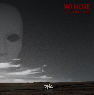
There is another strong cohesion between the CD sleeve and advert but not so much the music video - this is the colour. The covers, inserts, and adverts have the same harrowing colour effect of black-and-white with some red boldness, but this is not the case with the video. Had we known right from the start that is how our other products would turn out, we may have considered doing the same for the colour of our music video and shoot it in a way that we could incorporate lots of red colour for a variety of things onscreen. But having said that, if we had the exact same visuals in all three products, then sure enough there would be a strong link but it would then give an appearance of lack of imagination if they are all given the same treatment. Besides, the music video is a full representative of one song out of eleven on the album. We did give the video a grainy look, so it's not exactly bright-coloured. There is a synergy between the CD inserts and the music video as the inserts are full of images to do with the video, either being screenshots or stills we took on location.
The image on our magazine advert is taken
straight from the video
An already existing cohesion of the artist which we have followed is the placing of Roni Size's logo on our album cover, as he has the logo on his album covers; so our combination is effective enough.

Cohesion is important so that the product is recognisable and reaches its target audience's attention; this way the artist's sales and interest are continued as their fans stay loyal and remain interested in the marketing surrounding the artist - if an artist changes its established image, fans can feel disappointed and betrayed and lose interest. However, some artists do take the risk to alter the cohesion they have been following. A prime example is pop star Madonna, who evolved continously through changing her image every two years or so - new looks, new music styles, new ways of presenting herself, new attitudes, new acts, new designs etc. She proved a change of image does not lose all an artist's fans, indeed it can gain even more.
Our campaign gives a rather gritty and deep image which is unusual for Roni Size as he has already established himself. Obviously, were this for real, it could be an example of the artist moving into a new direction which could be succesful or not; given the subject matter I think it could gather plenty of interest.
In conclusion, I do indeed find the combination effective because all three products are cohesive and stand out due to the strength and meaning of its theme.
straight from the video
An already existing cohesion of the artist which we have followed is the placing of Roni Size's logo on our album cover, as he has the logo on his album covers; so our combination is effective enough.

Cohesion is important so that the product is recognisable and reaches its target audience's attention; this way the artist's sales and interest are continued as their fans stay loyal and remain interested in the marketing surrounding the artist - if an artist changes its established image, fans can feel disappointed and betrayed and lose interest. However, some artists do take the risk to alter the cohesion they have been following. A prime example is pop star Madonna, who evolved continously through changing her image every two years or so - new looks, new music styles, new ways of presenting herself, new attitudes, new acts, new designs etc. She proved a change of image does not lose all an artist's fans, indeed it can gain even more.
Our campaign gives a rather gritty and deep image which is unusual for Roni Size as he has already established himself. Obviously, were this for real, it could be an example of the artist moving into a new direction which could be succesful or not; given the subject matter I think it could gather plenty of interest.
In conclusion, I do indeed find the combination effective because all three products are cohesive and stand out due to the strength and meaning of its theme.


No comments:
Post a Comment