Friday, 26 November 2010

FEEDBACK QUESTIONNAIRE

Now that we have finished the video, we will hand out five questionnaires for feedback to people of our target audience (16-25 years old, enjoy drum and bass).
Here is what the questionnaire consists of:

1. Did you enjoy the video? Answer honestly.
2. Did you feel there was a message being conveyed, if so what?
3. How did you feel about the violence displayed on the music video?
4. Did you understand what the mirror scene was referring to; if so what is the correlation?
5. Which of the three scenarios do you find the most effective?
6. Which part of the video did you enjoy the most?
7. How clear was the meaning of their taking off the masks?
8. How well do you reckon the visuals matched with the audio?
9. What is our opinion on the shaking/distorted effect used throughout the video?
10. How conventional is the video for its genre of drum and bass?
11. Would this video encourage you to buy the album (which would be filled with similar songs and lyrical content)?
12. How effective and cohesive are the album cover and poster?
12. What would you have changed?
13. What would you have added?
14. Please rate out of 10. Do it!
1 - 2 - 3 - 4 - 5 - 6 - 7 - 8 - 9 - 10

Tuesday, 23 November 2010

ADIOS TO EDITING!

We have finished whey!

We realised that we had forgotten to add the Taxi Driver reference scene. Oh dear! Anyway we added those remaining clips in, but as a result the rap scene became out of time as the policeman starts rapping a while after Dynamite MC's vocals begin. We speeded the scene up apart from the gun miming but we still had more we needed to cut. As overlaying of Julia in our cigarette-jabbing scene is of the long-shot we had of her, we realised we could cut that scene as you cannot see her mouth moving; so even though her mouth is moving out of time, it is not noticeable at all. We cut the beginning of the scene so that it starts with a quick shot of the kid playing football, and cut some of my walking. The timing is now all matched.

Crucially to the drum and bass visual convention, we added in shakes and zooms through writing a formula so that our visuals match the tempo a bit more. After adding the song's title and artist at the begining, we finished. Whey! We are happy with our final result. Next step is to get audience feedback and work on our evaluation.

Saturday, 20 November 2010

JULIA STEPS ABOARD

Hola mi gente!!

So Ali already took the two files home to overlay Julia onto the narrative. We are happy with the result and are grateful for his work. However, he did it before we could edit the scenarios and so they remain too long. We cannot edit them as planned because as we now have Julia fading into the scenes singing, anything we cut out will mess up the visuals as she will be seen moving her mouth out of time to the vocals. We do not think that the edit error of the first character's head emerging through the corner twice can be noticed much as Julia is added into that shot and distracts the viewer from noticing.

We reckon that Julia is shown to a good extent, as her presence is not overstayed and does not lose its novelty. Actually, she only appears until halfway through the cigarette scene, then she disappears. So we will definitely add a shot of her into our gap later on. The way her happy face fades in and out of the violence works as a nice contrast in the visuals.

Friday, 19 November 2010

OUR TRIP TO CLC - ALBUM COVER, CD INSERTS, AND POSTER FINISHED

On tuesday we all travelled to the City Learning Centre at the Orchard School to create our fictional album cover, any cd inserts we want for what would be the leaflet inside, and a fictional magazine advert promoting the album.

Upon our arrival, the whole group was given a tutorial on how to use the programme Photoshop through using a picture of a Geisha-like woman who seemed to be modelling. The woman in charge there was very helpful as she guided us through tools and devices we used to edit the picture through removing parts, replacing them, adding effects and styles, all to the point that by the end it was completely different but remaining with the same face. Certain tools we used included the magic wand, which completely cut away parts of the image we did not want, and we learned some shortcut keys including the apple button +D to deselect things and apple and +Z to undo.


The CLC

But now it was time to get cracking on with the main task.

CD INSERTS

The images on the four inserts were a mixture of photos taken while filming and stills of the video, so we first had to find them on our e-mail attachments and add them onto the Photoshop programme.

The images were two separate ones of two of the criminals, one of the bike-mugged character lying on a pool of blood, and one of the policeman showing his badge. We chose these images because of both their cohesiveness with the video and their strength in effectiveness: two images of the criminals relates to the overall campaign and gives an alarming look to the cd inserts thus gathering interest, the image of the mugged victim lying in a pool of blood is harrowing and reflects the slogans we placed around the inserts, and the image of the policeman showing the badge is like a conclusion the first three images as if to say there is now some control.

Here are the images as they were when downloading them off our attachments:


The image of Ali on the ground is silghtly different to the footage in the video as there is a larger amount of blood (this being his position before attempting to get up), but this way it is more alarming and even makes it look like he is dead which goes better with the slogans we placed. This image was already different as it is in black-and-white apart from the blood which is bright red and stands out. We had decided we would use this after some inspiration from the visuals in the film 'Sin City', in which the colour is majorly black-and-white whilst some crucial colours (mostly of the blood in that film) are kept.


Here is an example of how the colour
red contrasts with the black-and-white
visuals of the film Sin City

Bearing in mind that the inserts were to be cohesive, we decided that each insert would be in the same style of black-and-white with a red colour. So after changing the colour to black-and-white, we stylized the images of the two criminals with the use of the 'Dark Strokes' effect (one of the visual effects available on the programme) which gave them a slight blurry effect and also contrasted the images, resulting in a somewhat rougher look which was altogether effective for the grittiness of the theme and the intimidation of these characters.


We added two slogans on each insert which conveyed the continuous message of anti-crime: the slogans read 'Face the world', 'Walk to the light', 'Unmask and be free', and 'The reward for good is life'. We used the red font for writing these so that we had the use of red. We also put Roni Size's logo at the top of the first insert, which we grabbed from the internet. For some reason, all the pictures of our inserts, cover and poster are coming up small so just click on them to view them better.


Inserts 1 and 2

So the next two inserts were the images of the victim bleeding on the ground and of the policeman. Once they were both in black-and-white, we played around with using the 'Dark Strokes' effect and some others but found that they didn't work with the image of the victim as each effect ended up blurring or somehow fading the blood which then did not look effective enough as we needed it to brightly stand out. So we left the image without any effects and added another slogan, this one saying 'No more crime on the streets - pain violence abuse'.


For the insert featuring the policeman, we stretched the picture out a bit to make him look bigger so that he looks a bit more authoritarian. We then added a few fictional credits for credibility. We know that Roni Size is fully in charge of his music - so the credit of producing, mixing, and arranging goes to him. We made up some fictional names for the rest, and gave ourselves a little wink by putting our names for the 'with thanks to' credits. Taking notice of how this section of album leaflets mostly say in small writing the country that the product was made in, the album's label, year of making and the artist's website, we put those details as well.


Inserts 3 and 4

ALBUM FRONT AND BACK COVER

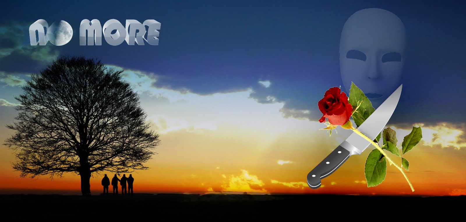
For the album's back and front cover, our final design differed a fair bit from our rough draft idea from a while ago. The original plan was to show a group of figures stood upon a hill in a paradise-like desolate location, with the image of the mask faded in the background to represent the threat they want no more of and an image of a knife and flower/s wrapped together symbolising violence against peace.

However, as we had to keep the cover cohesive with the inserts, it was clear this was also be in black-and-white with red. So the image was turned to black-and-white, and we used the red font for the all the lettering; this consisted of the album's title, artist, track list (the one we wrote a while ago), and brief info (record label/year/website). However, everything else apart from the landscape and mask were removed because they did not fit well with the new visuals. We again inserted Roni Size's logo, placing it on the front cover. We have achieved the look of desolation and emptiness, and of threat in the form of the mask, which is seen overlooking the landscape as if the violence and fear that comes with it goes everywhere.


A rough draft of the original idea


Our album cover

MAGAZINE ADVERT/POSTER

The image placed on magazine adverts of albums are usually extremely similar to the actual front cover: they will have small differences such as that there may be a close-up of something on the cover, or there may be one or two differences in the way people or objects are positioned. We decided that it would be more effective to use this image of the criminal character, which we zoomed into from our first image of our inserts so that the criminal is a lot closer, as it is quite a striking image and would hopefully the magazine readers' interest. Again, we used the black-and-white with red style, keeping up our overall cohesion.

We looked at real magazine adverts to see what text is written on them, so that we could make the advert as realistic and accurate as we could. They all mentioned the single/s that the advertised album contained, so bearing in mind that No More would be a single (as we made a music video for it) we headlined that and another song (the fictional 'Corruption', which we imagined that with that title the song would be hard-hitting) as the two tracks which people would have heard on the radio or online.

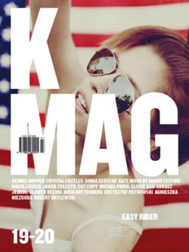
We wrote two quotes each from a fictional review from music magazines. The two magazines we decided we would quote our reviews from are Time Out Magazine and K Mag. Time Out is a global magazine (that in England is only sold in London) which has a music section with reviews and reports on a wide variety of music genres. K Mag is a UK magazine which focuses on drum and bass, hip-hop, breaks, dubstep, and electronica.


The quote from Time Out reads "An eclectic mix of hard-hitting breaks and basslines". This refers to the conventional sounds of drum and bass which I wrote about towards the start of the blog; whilst the song 'No More' is somewhat unconventional if placed under the drum and bass genre as it is quite soft and melodic. Other songs on the album would follow the more conventional sounds so that it can be properly categorised as a Roni Size drum and bass album. K Mag's quote reads "Electronic harmonies which hook you with deeply thoughtful lyrics", this refers to the socially conscious theme of the album. We want it advertised that the songs are not just plain repetitive drum and bass tracks, but that they do have harmonies worth listening to and have well-written lyrics which would provoke the listener to reflect on the issues brought up. I believe that an album containing this sort of material would be very appealing.

We also wrote that it is available on vinyl, as all drum and bass albums are so that they can be mixed and played on DJ sets, and available for download. Online programmes like iTunes store pretty much all discographies (of course there is also the illegal downloading but advertisements would not promote that).


Magazine advert

Monday, 15 November 2010

EDITING GOES ON AND ON

Hola mi gente!!

I was annoyed to see that Ali had decided to delete the clips of the policeman giving the camera the thumbs-up and of the three characters dancing. He said it looked bad because we were laughing but I think the laughing worked as it showed us being 'happy' and likeable. The problem now is that there will be a gap of footage to fill in at the end.

Anyway, we finally imported the song onto iMovie! The use of the rap audio enabled us to succesfully put together the policeman's rap scene. He makes some movements which we have synchronised with the rapping vocals, and we reckon it looks good enough to not need to re-film it. There is the problem that the vocals really sound like the rapper is black (he is) and our policeman is white..we can only hope most people will not take notice. If they do we can always just say it's a postmodern element! We end his scene with him throwing his gun on the floor as a way of finishing his lecture of stopping our violence.


We were also able to construct a different file in which we have roughly edited all of the clips of Julia so that we have a video of her 'singing' in order to the song from the start to end. There are quite a few gaps, as she did not sing the whole song through perfectly, but we now have lots of footage that we can add her into the narrative with.


We also added the establishing shot of our location and of the church at the start of our video. We have to do some editing regarding each character's scenario. In the phone-mugging scenario, the character looks around the corner and the next shot shows his head re-emerging even though it had already done so. The middle scenario simply has too much walking around, and mine has too much footage of the kid getting up and playing football. We only need a few seconds of it. As those two scenes got deleted, we now have a gap. What we will do is edit the track down by cutting the last chorus (many songs are edited down for their music videos) and have a final shot of Julia on her own before ending it with us taking off our masks. The final shot will be of the masks on the ground. Once we have sorted that, Ali can take it home and overlay Julia's file onto the narrative which should culminate in the end of our editing! Tomorrow we have our day at the CLC to create our CD sleeves and magazine advert.

Saturday, 13 November 2010

POST-MODERN IN OUR VIDEO

It is quite hard to end up not having any post-modern references as many can happen without any intention. The most notable postmodern element in ours is the intertextual reference to Taxi Driver, of which I have already plenty talked about.

The shot in which the bike-mugged victim is layed on the ground with a huge pool of blood is massively postmodern, and it continues to be so as he is then kicked and a further amount of blood splashes out. When we added this effect, we were discussing on editing out an amount of blood so that it looks realistic but then we realised how this blurring of 'real' and 'simulated' could work as a postmodern reference to countless moments in films where an extraordinarilt exxagerated amount of blood is sprayed (mostly in action flicks).


Other postmodern includes the policeman directly looking into the camera and giving the thumbs up, and when the criminals start happily dancing after they throw off their masks - mixing gritty issues with an unexpected humorous occurance is an element of bricolage.

The scene of the policeman rapping can also be categorised as postmodern because it is completely unexpected and nearly parodic in the way an uptight figure of authority suddenly starts rapping with swagger and briefly skanking.

Thursday, 11 November 2010

CONTINUING EDITING AND REFERENCING TAXI DRIVER

After uploading all footage, we had over twenty minutes of footage on the iMovie. Most of this is the footage of Julia as we filmed Julia for roughly ten minutes from two cameras so we have started chopping down on her scenes as well as trimming all other scenes. We have not yet been able to add the song to the programme as we cannot download it at home (a combination of download programmes not working for some of us and internet problems for the other). As a result, we cannot put the Julia singing scenes or the rap scene in order as we need the actual song on the programme so we can synchronize the words with the actors' moving mouths. For now, we have just edited out moments in which they were not performing or anything. We are definitely going to overlay Julia onto the narrative; if we were to have Julia in her own separate scenes, we would have to cut a lot of narrative footage and we need as much of it as we can to convey our message. Me and Aiden do not quite know how to overlay footage onto others, but Ali told us not to worry and that he will take the footage home when we have completed editing the narrative and performance sections so that he can do it at his home.

We are very happy with our effects. Lenses flares and colour contrasts have been added to the video; as a result the visual quality is a lot more stylized and looks like it could be a real video. We have also added blood to the shot that comes after Ali is kicked off his bike to emphasise the violence. WAY too much blood has been put - seriously you would think that with the amount of blood there is, his head exploded. However, when it came to toning it down, we decided to keep it in after all because it is rather epic and we can use it as a reference to violent moments in films where the blood is hugely exaggerated - POSTMODERNISM!


We are also satisfied with the effect of the cigarette being alight.


We still had to film the scene which references the Taxi Driver mirror scene, which we agreed I would do. So I steadily placed the camera and did a few takes (from different angles so we can mix it up during editing) to film myself entering the room and sitting down on the bed upon which I take off my white trainers (ay!) and then get up to the mirror. For the main part in which I mime pulling out the gun like Travis Bickle, I held the camera and kept it hidden from the shot as I filmed my reflection doing so.


Afterwards, for the sake of fixing the shoe continuity error, I filmed a close-up of me putting on the brown trainers whilst the white ones remained within the shot too. Obviously there is no reason why the character would do that, but that way people will see me changing shoes and then later on not think "hey how come he is wearing different shoes? continuity error!"